POST #54 - EVALUATION QUESTION 2
For this question, I'm going to talk about how my ancillary tasks and music video coincide with each other, and demonstrate clear synergy and a consistent theme between products.
To see if the theme was identifiable and easy to link together, I gave people a selection of four screenshots and four posters; one of each category was from my music video, and the rest were from other music videos from other people in Year 13 media. I asked the participants a series of questions and requests involving the screenshots and posters, including;
Here's a recording of one of my participants, being my sister Martha. She only knew the topic of my music video, and had not seen the music video or ancillary tasks before this experiment.
Martha's answers were similar to the other candidates for this test; everyone picked out the correct poster and screenshot, and gave justification for why they were from my video. Many people picked out the consistent usage of fonts (especially the Impact font), the use of certain imagery which is synonymous with my theme, all of which are used in my actual music video (like Dat Boi, Drake and dabbing).
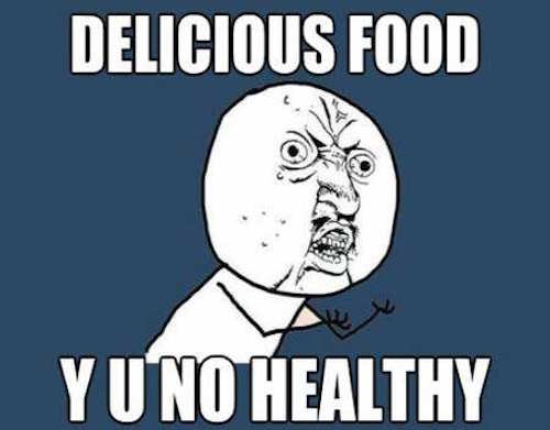
These were definitely my constants that I wanted to keep throughout everything to do with the music video. Many aspects of the imagery I used go hand in hand with the meme theme. The impact font was definitely the biggest thing with keeping the theme; memes between 2005 and 2013 used the impact font along with original memes, which gave the public 8 years to match the two together.


In my final music video, I used Impact for every title there was; the song title, the opening credits, the closing credits, etc. By using this theme in my ancillary tasks as well, this creates a clear link between the products. And if any fonts WEREN'T in Impact, they still inherited the stylisation of the older memes, by having the white text with a bold black outline.
Dat Boi is also a common link between my products, due to the status of the original meme being well respected in the community. Dat Boi is an easily recognisable meme, with a longer lifespan than most memes have nowadays. Dat Boi has one appearance in each product I made; a 2 second cameo in the music video, an appearance on the poster, and an appearance on the cover of the digipak.
To see if the theme was identifiable and easy to link together, I gave people a selection of four screenshots and four posters; one of each category was from my music video, and the rest were from other music videos from other people in Year 13 media. I asked the participants a series of questions and requests involving the screenshots and posters, including;
- Pick out the screenshot for my music video
- What makes you think the chosen screenshot is from my video?
- Pick out the poster for my music video
- What makes you think the poster is for my video?
- Would you say both the screenshot and the poster originate from the same music video?
- If yes to the above, why?
Here's a recording of one of my participants, being my sister Martha. She only knew the topic of my music video, and had not seen the music video or ancillary tasks before this experiment.
Martha's answers were similar to the other candidates for this test; everyone picked out the correct poster and screenshot, and gave justification for why they were from my video. Many people picked out the consistent usage of fonts (especially the Impact font), the use of certain imagery which is synonymous with my theme, all of which are used in my actual music video (like Dat Boi, Drake and dabbing).
These were definitely my constants that I wanted to keep throughout everything to do with the music video. Many aspects of the imagery I used go hand in hand with the meme theme. The impact font was definitely the biggest thing with keeping the theme; memes between 2005 and 2013 used the impact font along with original memes, which gave the public 8 years to match the two together.


In my final music video, I used Impact for every title there was; the song title, the opening credits, the closing credits, etc. By using this theme in my ancillary tasks as well, this creates a clear link between the products. And if any fonts WEREN'T in Impact, they still inherited the stylisation of the older memes, by having the white text with a bold black outline.
Dat Boi is also a common link between my products, due to the status of the original meme being well respected in the community. Dat Boi is an easily recognisable meme, with a longer lifespan than most memes have nowadays. Dat Boi has one appearance in each product I made; a 2 second cameo in the music video, an appearance on the poster, and an appearance on the cover of the digipak.
The cover of the digipak and the poster also try to go for a more retro feel, which would seem out of place if it wasn't for the VHS styled flashback scenes in the original video. The effect I used for the digipak cover even uses the same colour balance effects as the flashbacks have.
My mise-en-scene was the strongest aspect of the raw footage, which is especially true to the most important prop in the video. When asking people their opinions on the props in the music video, every single person pointed out the Shrek DVD at the end. Shrek has been a meme for the past 5 years, and including the film calls back to the theme and creates a clearly link within the video itself.
I'm very happy with the synergy and links between everything I made relating to the music video; my audience can clearly recognise my products over others due to a clear theme which is carried over from product to product.


Comments
Post a Comment